
Are oil price spikes good for the US?
In aggregate, maybe.

Brent crude hit $118 a barrel today for obvious reasons: a supply shock. The Strait of Hormuz, through which roughly 20 percent of the world’s seaborne oil normally flows, has been closed since the U.S. and Israel struck Iran in late February. Tanker traffic is down 70 percent.
A lot of news stories have turned that into a discussion about inflation and recessions. I think we need to be careful about how we think about this, especially if we are just thinking about the U.S. economy.
It seems that the people doing the debating haven’t updated their model of the U.S. energy economy. As I’ve explained before, it’s kind of an artificial divide between supply and demand. From another perspective, the U.S. hasn’t had a supply shock, at least not directly. We need to be careful. The country they’re worried about, the one that hemorrhaged hundreds of billions of dollars every time OPEC sneezed, doesn’t exist anymore.
How big of a deal for the U.S.? Let’s use price theory to do some basic calculations.
Who Gains and Who Loses?
When energy prices rise, every country has consumers who lose and producers who gain. High prices or low prices aren’t blanket good or bad. The national effect depends on which side of the trade you’re on.
Think about extreme examples. Take Saudi Arabia. When oil hits $118, Saudi consumers pay more for gasoline, just like everyone else. But the Saudis now export about 7 million barrels a day to the rest of the world.
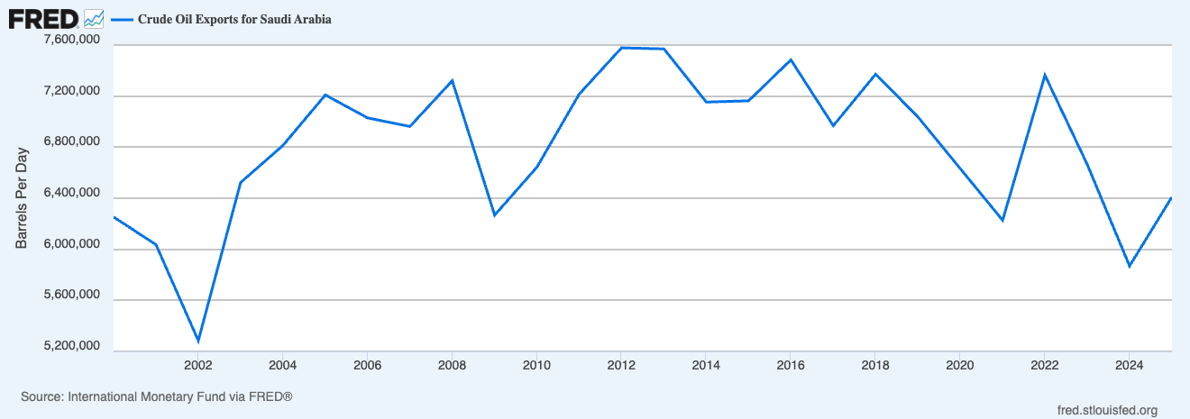
Clearly, the export revenue dwarfs the consumer cost. When we add it all up, an oil price spike is a massive windfall for Saudi Arabia. This changes terms of trade and other aspects, but the key is that ultimately those exports are more valuable and give Saudis control over more real resources in the global economy. That’s why nobody runs a headline asking whether Saudi Arabia is “hurt” by high oil prices. Again, yes some people are (especially in a brutal regime that doesn’t share gains), but at a conceptual level it makes sense that we shouldn’t think of a negative oil shock as hurting them.
On the flip side, think about Japan. Japan produces almost no oil. Every barrel is imported. When the price doubles, money flows out to foreign producers and no Japanese producer captures the other side. They are poorer and control fewer resources. Japan is unambiguously worse off.
In general, when the price of oil rises, consumers pay more and producers earn more. And consumers here means anyone using oil as an input, not just people at the gas pump. In a closed economy, when a Saudi consumer pays more for gasoline to a Saudi producer, money changes hands inside Saudi Arabia. Nothing enters or leaves the country. It’s a transfer, not a national gain or loss. The same is true inside the U.S., inside Japan, inside anywhere. Domestic transactions wash out in the aggregate.
The part that doesn’t wash out is the cross-border piece.
When a Japanese consumer pays more per barrel to a Saudi producer, that money leaves Japan and enters Saudi Arabia. No Japanese producer captures the other side. So the national welfare effect—to a first-order approximation—for any country is just: how many barrels cross the border on net, times the price change per barrel.
where M̄ is the average of net imports before and after the price change.
If you’re a net importer, M̄ is positive and the welfare change is negative. You lose. If you’re a net exporter, M̄ is negative and it flips. You gain.
Think of it like owning your house when house prices double. As a homeowner, you’re richer. As someone who needs housing, you’re poorer. If you’re staying put, the two effects cancel.
The nice thing about this simple calculation is that you need just two numbers: how much do you import or export on net, and how much did the price move?
How can we possibly say that with so little information? What about elasticities? Aren’t those crucial?
Remember this is a first-order approximation. When prices rise, consumers and producers both respond. Consumers buy less. Domestic producers supply more. Imports shrink. But the value of those marginal barrels, the ones no longer traded, is approximately equal to their cost. The first barrel you stop importing was barely worth importing in the first place. The welfare effect of the quantity response is second-order, a triangle.
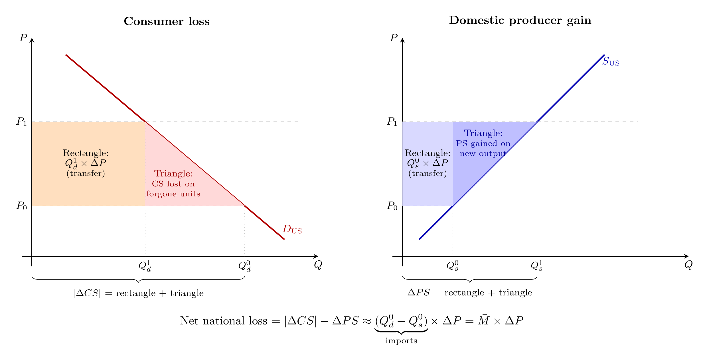
The first-order effect is the full rectangle, equal to the price increase multiplied by the volume traded. That rectangle is pure transfer, dollars moving from buyers to foreign sellers on every barrel still traded. Yes, you need elasticities to calculate the triangle. You only need quantities and prices to calculate the rectangle. We will say more about this later.
So, where does the U.S. fall?
For most of the post WWII period, firmly on the importer side. For example, in the 2000s, the U.S. was importing 10 to 12 million barrels a day. Let’s keep easy numbers. From April 2009 to Feb 2011, oil price doubled, from $50-100. doubling of oil prices meant a national loss on the order of M̄ × ΔP ≈ 10 million barrels/day × $50/barrel × 365 days ≈ $180 billion per year, about 1% of GDP transferred to foreign producers. The true loss was somewhat less, because Americans reduced their imports in response. We will say more about that. But the sign was obvious and the magnitude was nothing to sneeze at.
I think this is everyone’s starting point for thinking about oil prices. We saw the importer story play out again in Europe after Russia invaded Ukraine in 2022. Europe depended on Russian pipeline gas.
But the U.S. is not in that position anymore.
The shale revolution, which accelerated through the 2010s, turned the U.S. into a net petroleum exporter. In 2023, the U.S. exported 10.15 million barrels per day of petroleum products while importing 8.51 million, a net export position of 1.64 million barrels per day.
So, today, the formula has flipped. A price increase on goods you sell to the world is a terms-of-trade gain. At $50 per barrel above the pre-war baseline and using pre-war export volumes, the U.S. comes out roughly $30 billion per year ahead. As shale producers ramp up and consumers cut back, net exports grow, and the true gain is larger. That’s small relative to a $30 trillion economy, but the direction matters. The U.S. gains from this crisis. Not by a lot. But it gains. It certainlty doesn’t lose like
And we can follow this through to other markets to get beyond the simple baseline. Petroleum is only part of the story. The U.S. is also the world’s largest exporter of liquefied natural gas, shipping 15 Bcf/d in 2025.
Between petroleum and natural gas, the U.S. net gain from the crisis is in the range of $60 to $70 billion per year. Small relative to GDP, but taken together, the U.S. is better off, not worse. Again, this is the first cut. There are more complicated stories about supply chain networks and what not and any adjustment is takes time to adjust to.
You can see it in prices. I’ve talked about the oil price as if there is only one but that’s not quite right. The Brent-WTI spread has blown out to roughly $10, more than double the usual $2 to $5 gap. Brent reflects every barrel exposed to the Strait of Hormuz. WTI reflects a domestic market backstopped by shale.
Now, this first-order logic is usually applied to small price changes, where the triangle is negligible, just looking at one side. But here, a 73 percent increase in the price of oil is not small. The triangle matters.
But we still have two offsetting triangles. So which way the bias runs. For a net importer, the quantity response shrinks imports: consumers cut back, domestic producers ramp up, and the country buys fewer foreign barrels. The rectangle calculated at the original import volume overstates the loss, because some of those barrels are no longer being purchased. The triangle correction makes the loss smaller.
For a net exporter, the same responses work in reverse. Higher prices mean more domestic production and less domestic consumption, so net exports grow. The rectangle calculated at the original export volume understates the gain, because the country is now selling more barrels at the higher price. The triangle correction makes the gain larger.
What about inflation/stagflation?
The above was about quantity. What about the price level? Does this perspective change anything?
Let’s think through a simple AS-AD model. When I used to teach the 1970s oil shocks, I’d talk about that as a negative supply shock. Because of oil prices rising, production costs rise, so firms produce less at every price level while charging more. Prices go up, output goes down.
But that’s a bit too simplistic. I know. Shocker that literally the first model doesn’t capture everything. But we can build from it.
The nasty thing about oil is that it hits everyone. It’s not just a supply shock. As we worked out above, oil really hits both sides of the market. (HT: Pedro Serôdio for flagging this inflation connection.) It’s a demand shock, and which way demand moves depends on whether the money stays home.
For a net importer, an oil shock shifts AS left unambiguously. Energy is a production cost, and the price increase is a pure drain. That’s the story I told. But AD shifts left too, because income flows to foreign producers. You get the supply dilemma plus a demand recession on top. The AD shift makes the quantity drop worse but actually tempers the inflation part.
For a net exporter, we still have the AS shock left. Energy is still a cost of production, so there is cost-push pressure. But the export windfall raises income, which works the other way. You have a bigger inflation spike but less of an output fall.
We can see this with the trust ole graphs. Both panels below start from the same equilibrium. AS shifts left by the same amount in both. The difference is entirely on the demand side. For the importer, income drains to foreign producers, so AD shifts left too. For the exporter, the revenue stays home. AD shifts right.
Quantitatively, the AD effect may not be too large for the United States, but it is definitely large for large importers.
I think this helps us make sense of oil shocks in recent years. Europe after the Russian invasion in 2022 is more classic stagflation, both curves shifting the wrong way. The U.S. in 2022 wasn’t really affected.
This complication illustrates the difficult spot the Fed is in with “seeing through supply shocks.” PCE includes gasoline and heating oil directly, so it will look alarming. But the GDP deflator, which tracks domestic production prices, tells a calmer story. If the Fed reacts to the PCE number and tightens aggressively, it risks creating the recession that the oil shock itself would not have caused.
Shocks still hurt
If the country gains, why does $118 oil feel so terrible?
The big thing is that producers and consumers are not the same people. When oil prices rise, energy companies and mineral rights holders capture enormous gains. Workers take a hit to their real wages. Sure, the national pie doesn’t shrink. But any price change has winners and losers.
Again, we can think through the logic in a simple example. Start constant returns to scale model of production. If you can replicate a business by doubling all its inputs, then doubling inputs doubles output. There are no fixed factors collecting rents. Every dollar a firm takes in goes out the door as payments to labor, capital, or energy.
Revenue equals costs, always. So if the energy bill goes up by a dollar, wages or capital returns must go down by a dollar. The question is which one gives. Write this in percentage changes: the percentage change in the output price is a weighted average of the percentage changes in input prices, where the weights are each input’s share of total cost.
Who eats the cost?
As we stressed in the context of capital taxation, in the long run, capital is mobile. It flows to wherever the return is highest. If a factory in Ohio offers a lower return than one in Germany, investment goes to Germany. Capital won’t accept a lower return just because American energy got expensive. It leaves, and keeps leaving, until the return is back to normal.
Capital can escape. Workers can’t. They live here. They work here. So labor eats it.
We can work out the number. The real wage decline equals the ratio of energy’s cost share to labor’s cost share, multiplied by the real increase in energy prices.
Today, the energy cost share in the U.S. is about 6 percent. The labor share is about 58 percent. The ratio is roughly one-tenth. Oil is up about 70 percent, but natural gas — half of U.S. energy consumption — has barely moved, so the composite energy price is up maybe 35 percent. Have I mentioned this is back-of-the-envelope? One-tenth times 35 percent. We’re talking a real wage hit of 3 to 4 percent.

That’s nowhere near the 1970s. Back then the economy was far more energy-intensive. Suppose energy’s cost share was double what it is today. Natural gas was regulated and pegged to oil, so when oil quadrupled, everything quadrupled. A bigger price shock hitting a bigger cost share produced real wage declines on the order of 15 to 20 percent. Way worse than today (so far).
Of course, nobody is only a worker. You might take a 3 percent real wage cut and also hold Exxon shares that are up 40 percent. People own mineral rights, have 401(k)s heavy in energy, heat their homes with cheap natural gas. How much the shock hurts you personally depends on your whole mix of income, not just the paycheck. But most people’s mix is mostly paycheck.
But, again, we are neglecting the exporting. Some workers are the producers. Their wages are going up, their overtime is going up, their industry is hiring. The cost-share identity gives you the average. The average hides the fact that oil-patch labor is on the winning side.
All of the above came from a handful of simple models. One equation for national welfare. One cost-share identity for real wages. One AS-AD diagram for inflation. None of them required a computer. None of them required forecasting anything.
The gut reaction to $118 oil is that it’s bad. The price theory reaction is instead to work through the models, bad for whom, through what channel, and are you sure? The answers turn out to be more interesting than the panic.
Very good post, but a few small points. If the oil price rise is caused by a war that reduces Saudi Arabia's ability to export, then the effect would be ambiguous. Price up, output down.
The effect of negative supply shocks on AD is often as you suggest, but in my view that's mostly because of inappropriate Fed responses. You can think of NGDP targeting as a policy of keeping AD stable when there is a supply shock, at least according to a simple definition of AD (total nominal spending on domestic output.)
Nice.
But have you assumed in going from the penultimate equation to the final equation not just that there is no change in the cost of capital (which I could understand) but also that capital's share of cost is zero?